Hi, I'm Jeremy.
I make visual systems. I am best at designing typefaces, icons, color palettes, and user interfaces.
Want to work together? You can email 'me' at jeremybanka dot com or message me on Twitter.
Skills & Tools
type and icon design
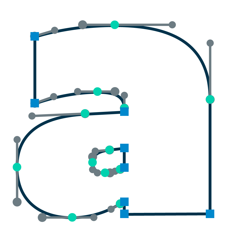
Self-taught in Glyphs, I've finished more than fifty text font masters, each 50–244 unique letters, and several logotypes.

color theory
I design meticulously coordinated color palettes using Adobe Illustrator, precise ratios, and a well trained eye.

web design
I wrote this site from scratch using Jekyll. In making, I learned from Ian Lunn (hyperlink effects), CSS Tricks (smooth scrolling), and Malihu (scrollbars).
Experience
Currently 2019
Looking for work, keeping my type, JS, CSS, and Jekyll skills sharp.
AIGA Chapter President 2017–2018
Ran weekly officer meetings, planned events, delegated promotional tasks, and conducted a typography design workshop for OSU's AIGA Graphic Design Club.
Student Health Services 2016–2017
Produced building signage, promotional posters, and informational brochures for Oregon State University's on-campus clinic.
PACE 2015–2016
Produced web graphics and banner ads with a team of social media administrators and copywriters to market OSU's Professional and Continuing Education division.
Occupy: Posters by the People for a Digital Age 2015
Collaborated with the head of OSU's graphic design school to design an art exhibit featuring more than thirty works from the Occupy Wall Street movement.
Education
Oregon State University 2014 – 2018
Honors Bachelor of Fine Arts, Graphic Design
- Graduated magna cum laude.
- Honors Degree: Wrote a thesis in information and game design for my original card game for the University Honors College.
- BFA Capstone Project: Led a small team of designers to illustrate the card game and product line.
Advantage Accelerator Program
- Planned a business model for my Wayfarer card game.
Awards
CDAK Certificate of Merit 2017
[Communication Design Association of Korea] for an animated poster using original display type.
CDAK Certificate of Merit 2016
For abstract typographic poster designs.
International Baccalaureate Diploma 2014
Background
In my sophomore year of high school, I took an English class that inspired me. My teacher, Mr. Jeff Hammonds, was an incisive critic, a storyteller, and truly pedantic grammatician. Realizing that our high school curriculum gave us no formal instruction in technical grammar, he would give us a warmup of his own design each day of his class. These would demonstrate some convention in English syntax or punctuation. I had read enough at this point to 'feel' all the correct answers, but I couldn't explain why a given answer was correct. It was the first time I'd thought about the invisible complexity of language.
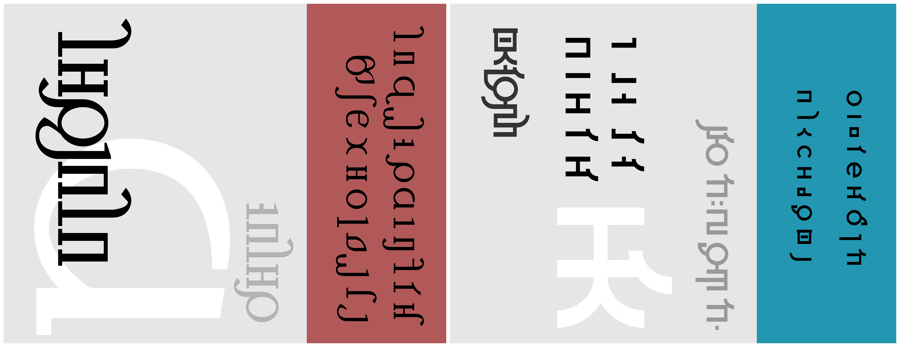
Enthralled, I pored over any Wikipedia pages I could find on linguistic typology. I started paying less attention in classes, using what I learned to come up with my own structures and ideas for strange languages. It was an entertaining way to test my own knowledge, and fill the empty hours of school. By my senior year, I had developed an aprioristic constructed language called Srailese with a lexicon of around a thousand English-word equivalents and several totally unique features.
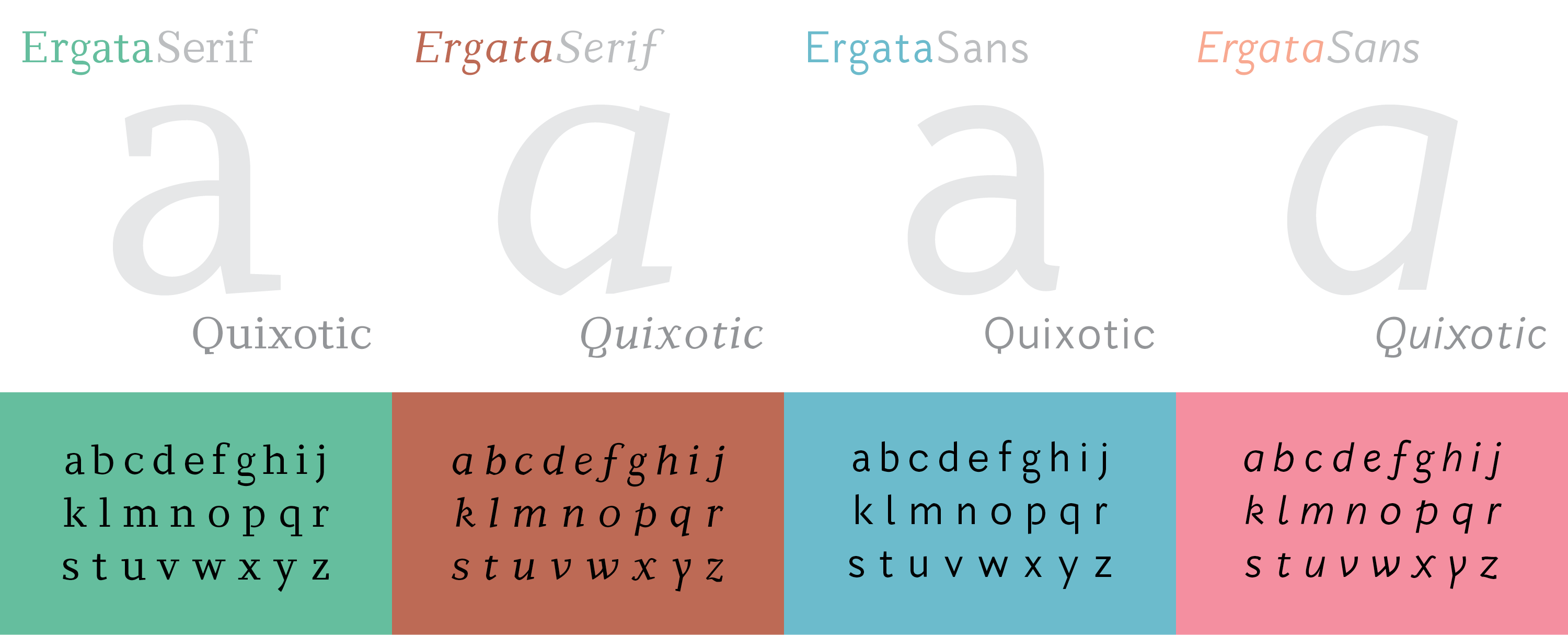
It was during my period of work on Srailese that I read my mother’s copy of Ellen Lupton’s Thinking with Type, a good book with exceptional typesetting. I fell in love with Martin Majoor’s Scala, in which the volume was set. I based the first typographic alphabet for Srailese on Majoor’s neo-Baroque masterpiece, and the second on Akzidenz Grotesk.
I discovered that the visual structures of language gripped me as strongly as the abstract structures, and during my first year of college, embarked upon typographic design as a personal hobby. With the extracurricular guidance of a typographically knowledgeable professor, I proceeded to design the 2015 Ergata type family, my first set of Roman fonts.
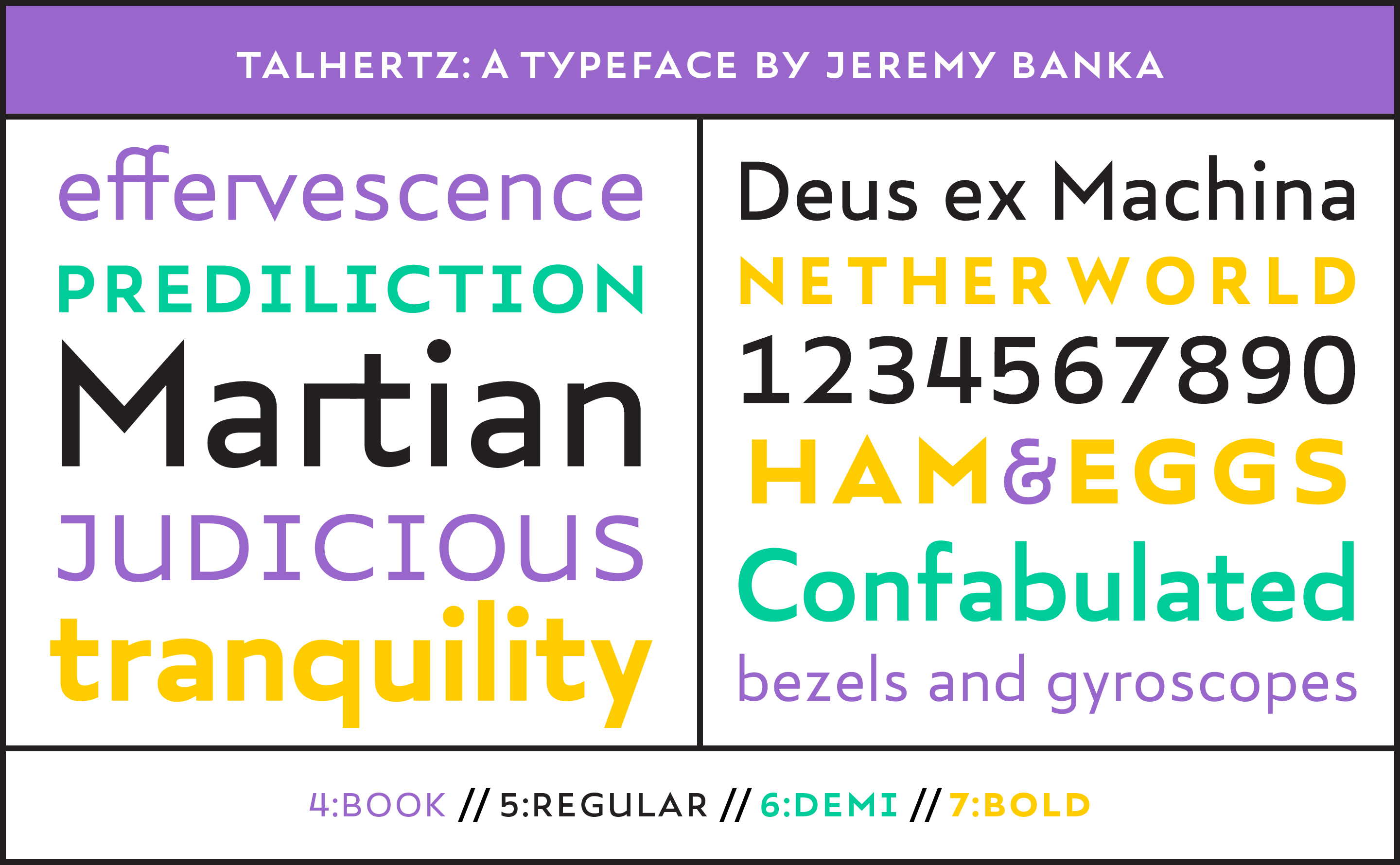
Since then, I have continued to design typography, chiefly text faces for my own design work. In 2017, I published Talhertz, my first public-release font.