Sound & Vision
AS GRAPHIC DESIGNERS, we should strive to make to world around us a better place for people through convenience and aesthetics. Color is a powerful conduit for aesthetic joy, so we should strive to be as sophisticated in our use of color as possible. For people with good aesthetic sense choosing color intuitively in Illustrator yields good results—it’s easy enough to play with the color mixing UI until a pleasant combination reveals itself. However, as the complexity of a job increases, a purely intuitive approach will prove more tedious and frustrating. In the case of a deep brand system with a modular color set used in multiple subordinate combinations, an algorithm to help designers safeguard against unaesthetic, system-breaking coincidences is extremely helpful.
The project that inspired my in-depth research into color was Delve, a card game with a very complicated color system. I realized that the cards I had designed were beautiful in an isolated context, but could produce ugly combinations with one another. I decided to return to the drawing board an invent a system that would use aesthetic combinations of color as its foundation, and would control as much as possible against disharmonious coincidence.
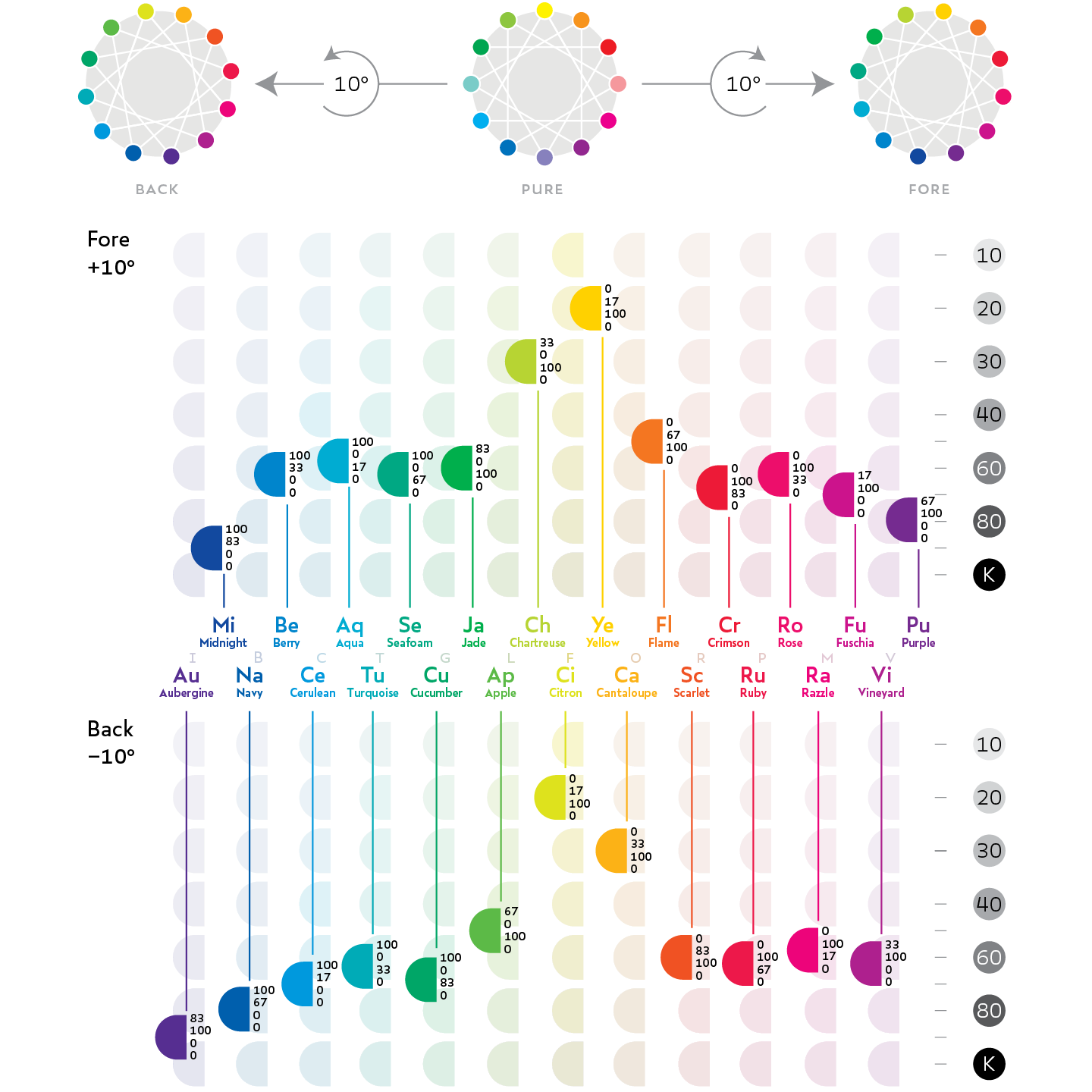
To design such a system, I started with the basics. I was working in print, so I experimented by mixing colors with different combinations of process hues and catalogued the results. I learned that a full measure of only one process hue yields a primary color. I learned that a full measure of two process hues yields a secondary color, and I learned that a full measure of one process hue and a half measure of another yields a tertiary color that falls exactly between an adjacent primary and secondary in hue. I also discovered that colors created through this method were maximally saturated, and that colors were less saturated when they (1) did not have 100% in a process hue, (2) had more than 0K, or (3) had some of all three process hues. I devised a simple mathematical algorithm to design a color of a hue at a specific darkness value through proportional reduction of its constituents or the addition of K, then devised a regular nomenclature for colors generated through this process.
I then realized that the extraction of twelve regularly spaced intervals from a spectrum and a theory of their interaction was not new: this is what music theory is. I imagined that my twelve colors were notes, and then began to play chords.
A tritone is equivalent to a direct complement. Fourth and fifth intervals are akin to indirect complements, and also have pronounced aethetic resonance in the visual medium. An augmented chord is analogous to a perfect trine, while a diminished chord is analogous to a half-square. Diatonic scales function wonderfully as the kind of rationally-constructed but deeply complex palette system architecture I had originally envisioned.
While this system helped me create excellent hue architectures, some combinations of colors whose hues were diatonically related still looked awful together. The principles of disharmony are quite different between sound and vision: sounds close in tone or with certain tone relationships are ugly, while colors close in darkness are ugly.
Finally, I designed a series of “palette modes” to which any hue structure could be applied, each specifically devised to control against any instances of colors of the same darkness competing. Gay palettes use loud colors and a dynamic darkness range. Dour palettes use quiet colors clustered around medium darkness. Soft palettes are light and unobtrusive, favoring pale colors and making its darkest colors relative to the background the most desaturated. Bold and Accent palettes cluster most of their colors at the extremes of the darkness scale, clearing the floor to one maximally saturated color somewhere in the middle. Bold palettes are dark-dominant, while Accent palettes are light-dominant.
The adoption of this system has led to vast improvement in the aesthetics and functional coherence of the Delve system. The Chromata Colortuner system is a powerful piece of visual design technology.
Introduction
During my sophomore year of college during the Spring of 2016 I became interested in the study of color. At the time, I was in the late planning phases of Delve, a trading card game based on an elaborate color system. Yearning to build into Delve the depth of choice and customization found in other trading card games, I had taken a step back from my previous aesthetic experiments to consider how I might conceive of Delve as a holistic system of color-coded cards with broad visual inter-compatibility. The problem was that I had designed a color palette for each of the game's thirty-six class concepts purely by intuition. They independently looked beautiful, and any given two might look compatible together, but the color choices were intuitive, not deeply structured or semantic. My system had not sought to control against unaesthetic combinations, so some pairings that were practical within gameplay might appear ugly. This was unacceptable, so I sought a more sophisticated approach. The new system would need to unify practical and aesthetic compatibility from the ground up.
To meet the complex needs of the Delve system, I developed a theory of aesthetic color-printing over the course of a year. Through my development process, I created a palette-making algorithm inspired by the systems of harmony in Western music theory. Through understanding and applying this model, a designer can effortlessly achieve sublime beauty in the color palettes they craft and easily plan color systems that scale to a job of any complexity.
Terminology
Before getting into my color system itself, I will precisely define the meanings of some of the concepts I reference later on. First I shall cover the three experiential aspects of color before moving on to the aesthetic qualities of color.
hue
Hue is the experiential aspect of color that lets us estimate the wavelength of light. “Red” is distinct from “Green” by this aspect, even if the two are alike in other aspects (as above, where they are equally saturated and dark). Hue is comparable to pitch in sound (Red:F, Green:C#, etc).
darkness
Darkness is the experiential aspect of color that lets us estimate the amount of light we receive from a source. The darkness of a color is comparable to the octave of a note in sound—the same pitches:hues occur within each darkness-gradation:octave. However, there is a range of darkness gradation within which the hues of colors tend to be most perceptible to us.
vibrancy
Vibrancy (commonly, “saturation”) is the experiential aspect of color that describes the intensity of a color’s hue. In the Chromata system, True colors are the loudest, and Muted colors are the quietest. Vibrancy is comparable to volume in sound.
consonance
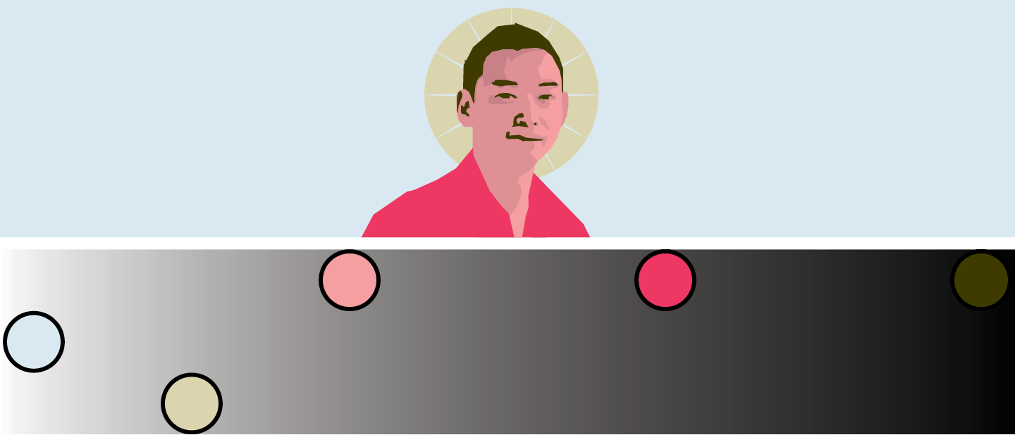
Consonance, concord, and harmony are terms for an aesthetic sensation of satisfaction. This feeling originates from the subconscious recognition of order and balance within something we perceive. We call objects that evoke this sensation “beautiful.” The figure above provides an example. Logically, consonance can be understood to “symbolize” order. Better yet, “order” and “beauty” can be respectively understood as conscious and unconcious impressions of structure.
dissonance
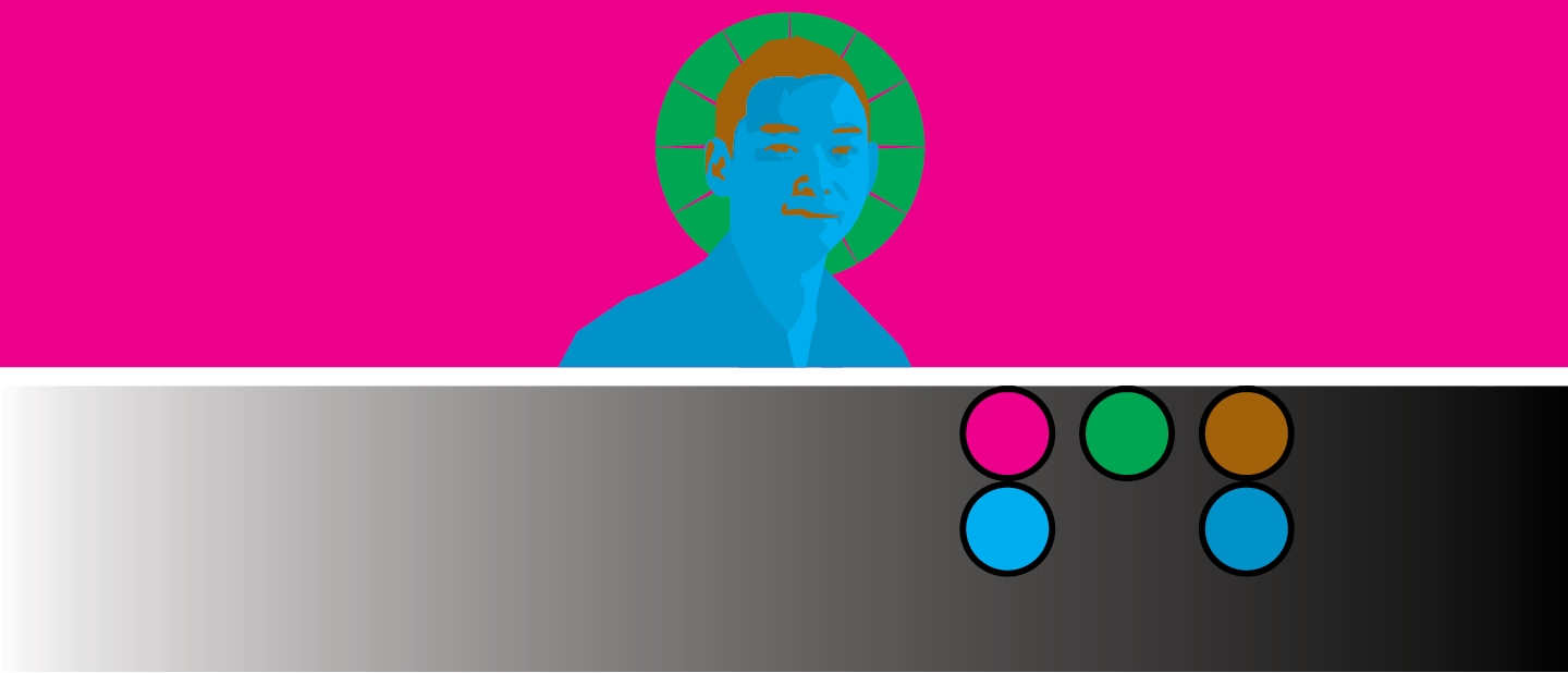
Dissonance and discord are terms we use for aesthetic discomfort. This feeling originates from an arrangement of forms from which we perceive "ugliness" or "clash." Dissonance arises subconsiously in reaction to forms that are “out of order” and intense. The above figure provides an example.
Beautiful forms evoke consonance while ugly forms evoke dissonance. Through careful attention to their aesthetic sense, fine artists, designers, musicians, and other craftsmen assemble consonant configurations intuitively.
But the structure that underlies aesthetic consonance,can be analyzed and modeled through rational means, or rationalized. The unconscious can be made conscious through analysis and synthesis, which is what I shall do here. A rationalized framework should allow the creation of complex color systems without frustration.
Colormixing
In this section, we’ll investigate how colors are mixed in the printer process system and colors formed through process can be classified.
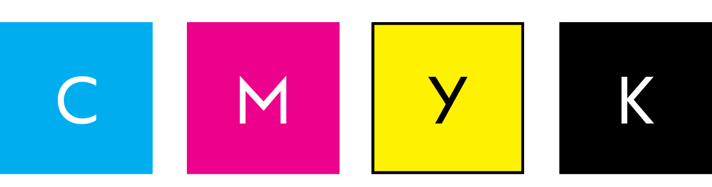
In process print, each color is made from a layered application of four inks: Cyan, Yellow, Magenta, and blacK. A process printer reproportions these four inks in a colormix to produce whatever color necessary. Changing the CYMK quantities in a mix results in a different color.
K is unlike the other inks. Unlike C, Y, and M, black contributes nothing to the hue of a mixed color, but only adds to its darkness, while reducing its loudness. Thus, K’s role in colormixing is unique, and it is excluded from references to the “process hues” (CMY).
primaries & secondaries
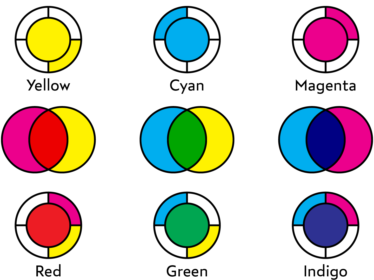
A Primary color results from a colormix incorporating only one of the process hues. The primary colors are Cyan, Magenta, and Yellow. A secondary color results from a colormix incorporating two hue constituents in 1:1 proportion. The secondary colors are Red (MY), Indigo (CM), and Green (CY). Note that the secondaries are darker than the primaries.
tertiaries
A tertiary color is found between each adjacent primary and secondary color. A tertiary is made by combining two process hues in 1:2 proportion—a full-measure of one, and a half-measure of the other. Violet, for example, incorporates a full-measure of Magenta (100M) and a half-measure of Cyan (50C).
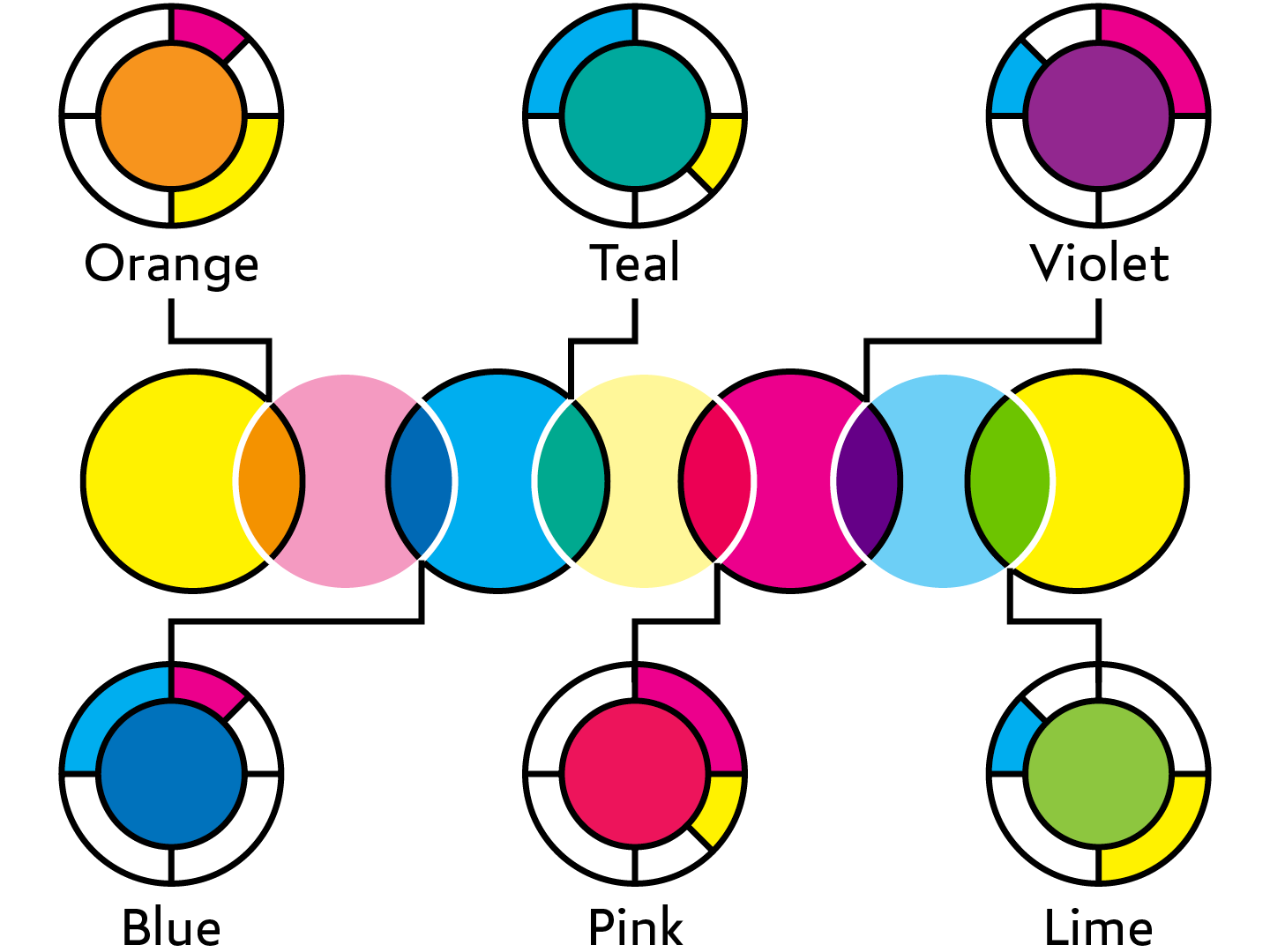
colorclock
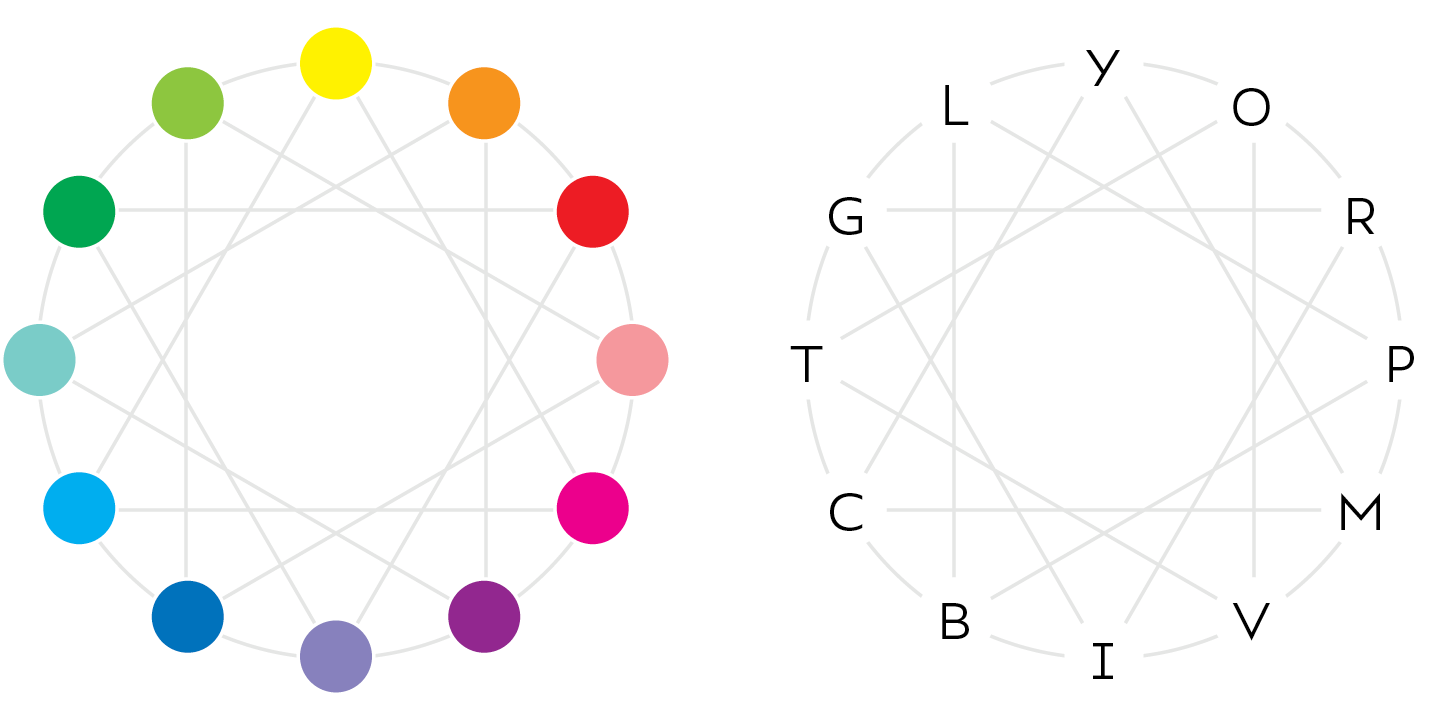
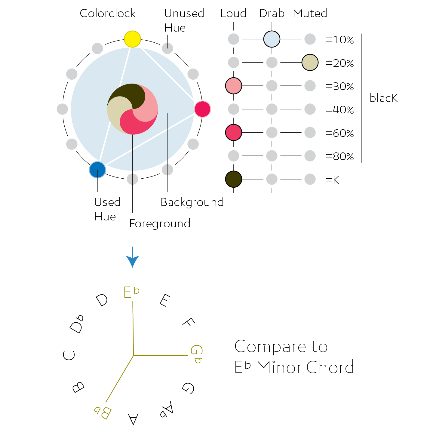
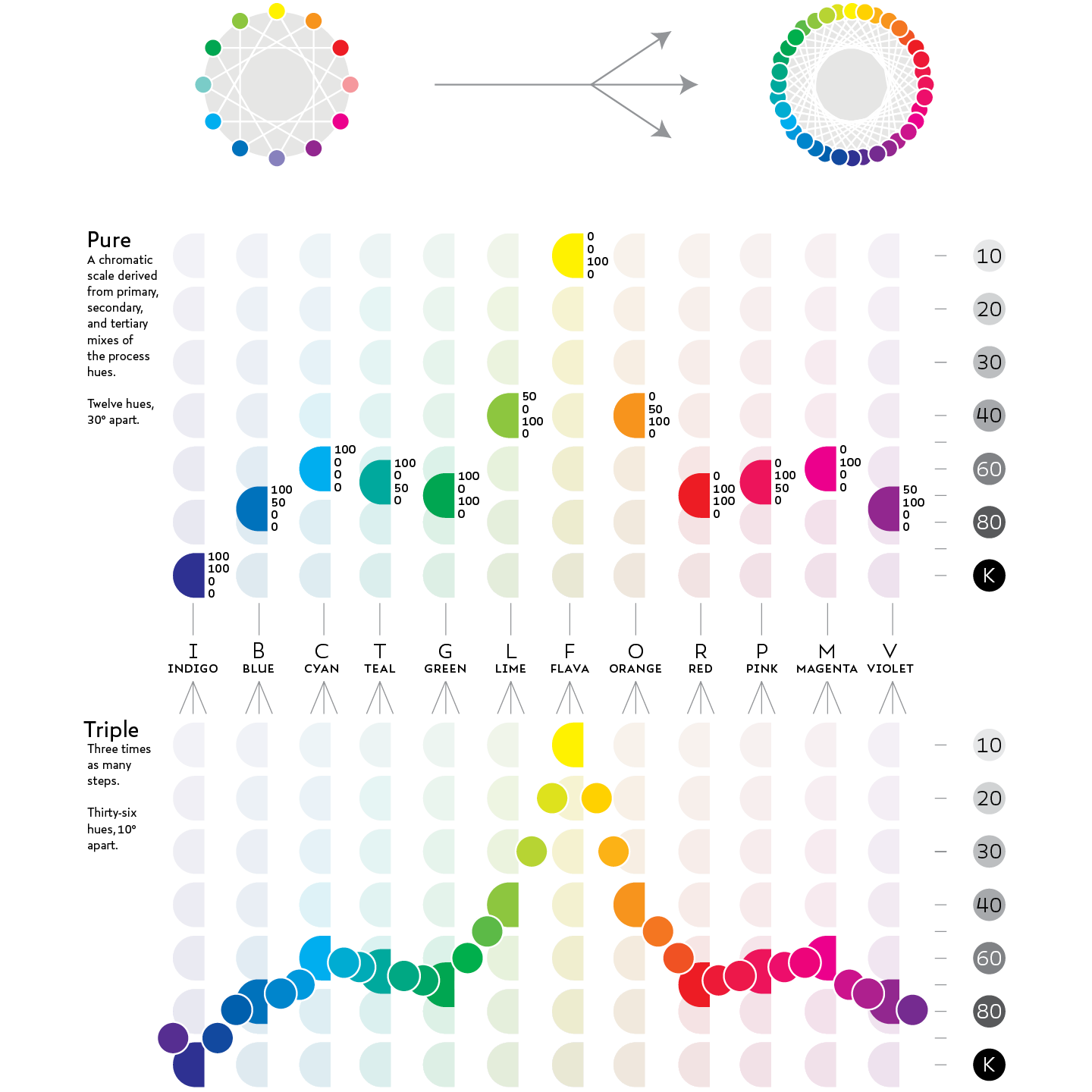
Together, the three Primaries, three Secondaries and six Tertiaries form a scale spanning the color spectrum in twelve discontinuous, evenly spaced steps, much like the chromatic scale in Western music. Arranged about a wheel—like hours on an analog clock—the continuous gradient of the color spectrum can be seen. I call this arrangement the “Colorclock.” It will be used to analyse color palettes in the next section, Chromata.
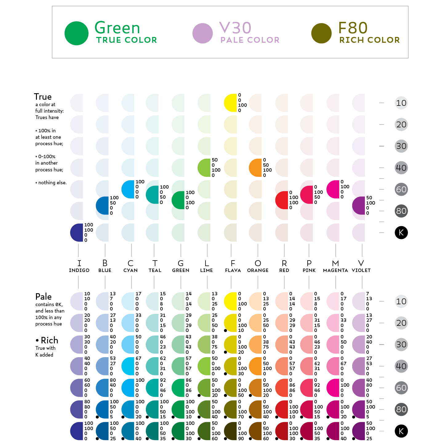
loud colors: true, pale, and rich
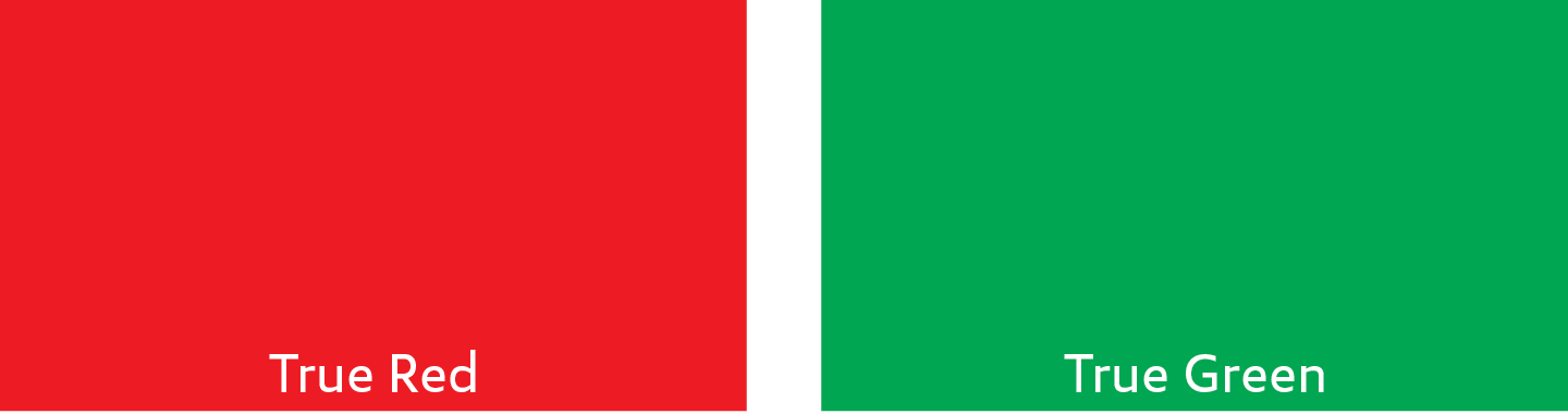
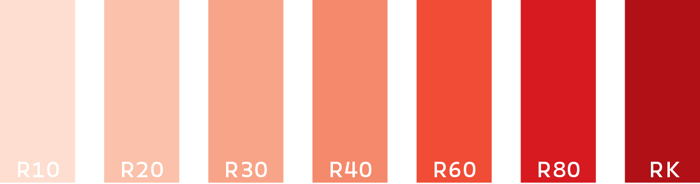
A True color the loudest it can possibly be, given its darkness. True colors are made from a colormix that includes 100% of one primary hue, 0–100% of another primary hue, and nothing else. In print, most true colors are darker than 60K. Orange and Lime (40K) and Yellow (10K) are the exceptions. The name of a True color is the same as the true color’s hue—e.g., “Red.” However, in most contexts, the affix “True” (“True Red”) should be used for the sake of clarity.
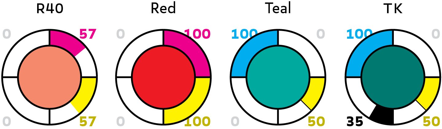
A “Pale” color incorporates less than 100% of up to two process hues and nothing else. A “Rich” color incorporates 100% of one hue constituent, 0–100% of another hue constituent, and 1–100K. Refer to Pale and Rich colors with a letter–number format. The letter, placed first, is the initial of the color’s hue. The number following the letter should equal the color’s grayscale equivalent. For example, a Red as dark as 40K would be named “R40.” If the color in question is as dark as 100K, “K” can be used in place of the number.
Collectively,True, Pale and Rich colors are called “Loud” colors. Loud colors are derived as directly as possible from True colors, and thus display their hues as close as possible to maximal loudness at the darkness level they were designed for.
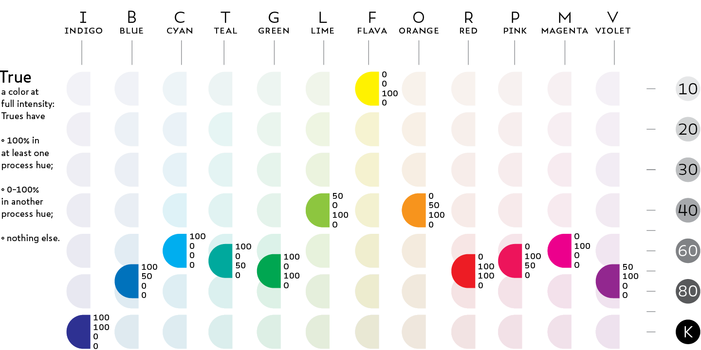
The inherent darkness (K-value) of a true color is a function of the inherent darkness of the hue constituents that form it and their proportions. The chart below plots the inherent darkness of every True color. Note that The darkness of a color is not always equivalent to the summed K-values its constituents. For example, True Indigo results from a colormix of 100C (=60K) and 100M (=60K). However, Indigo is equivalent to ~90K.
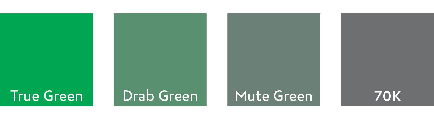
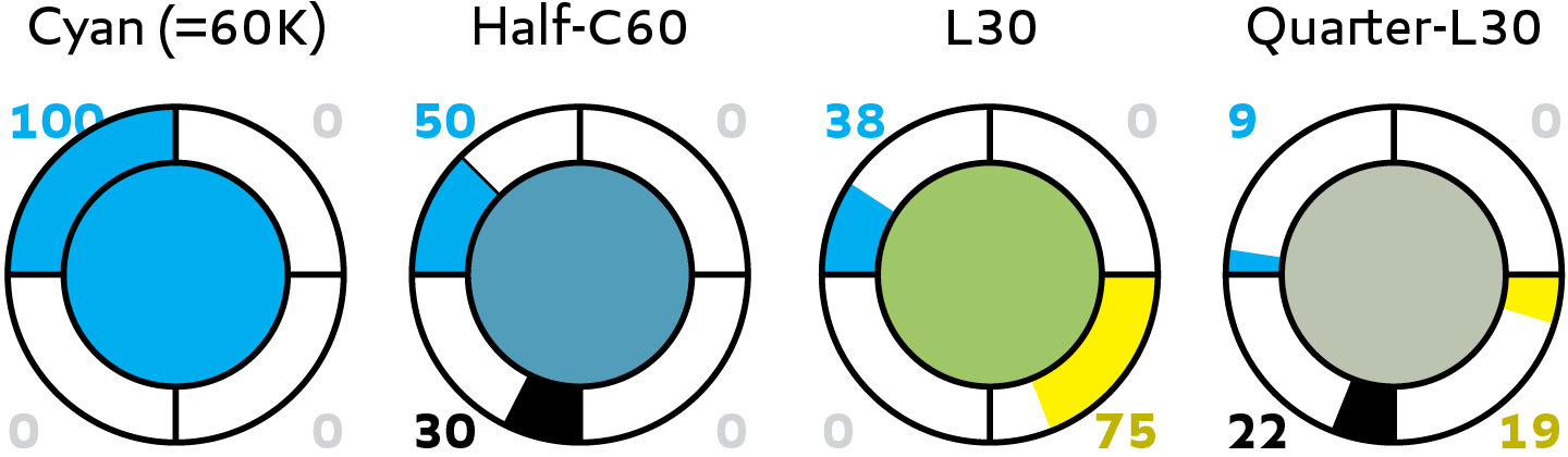
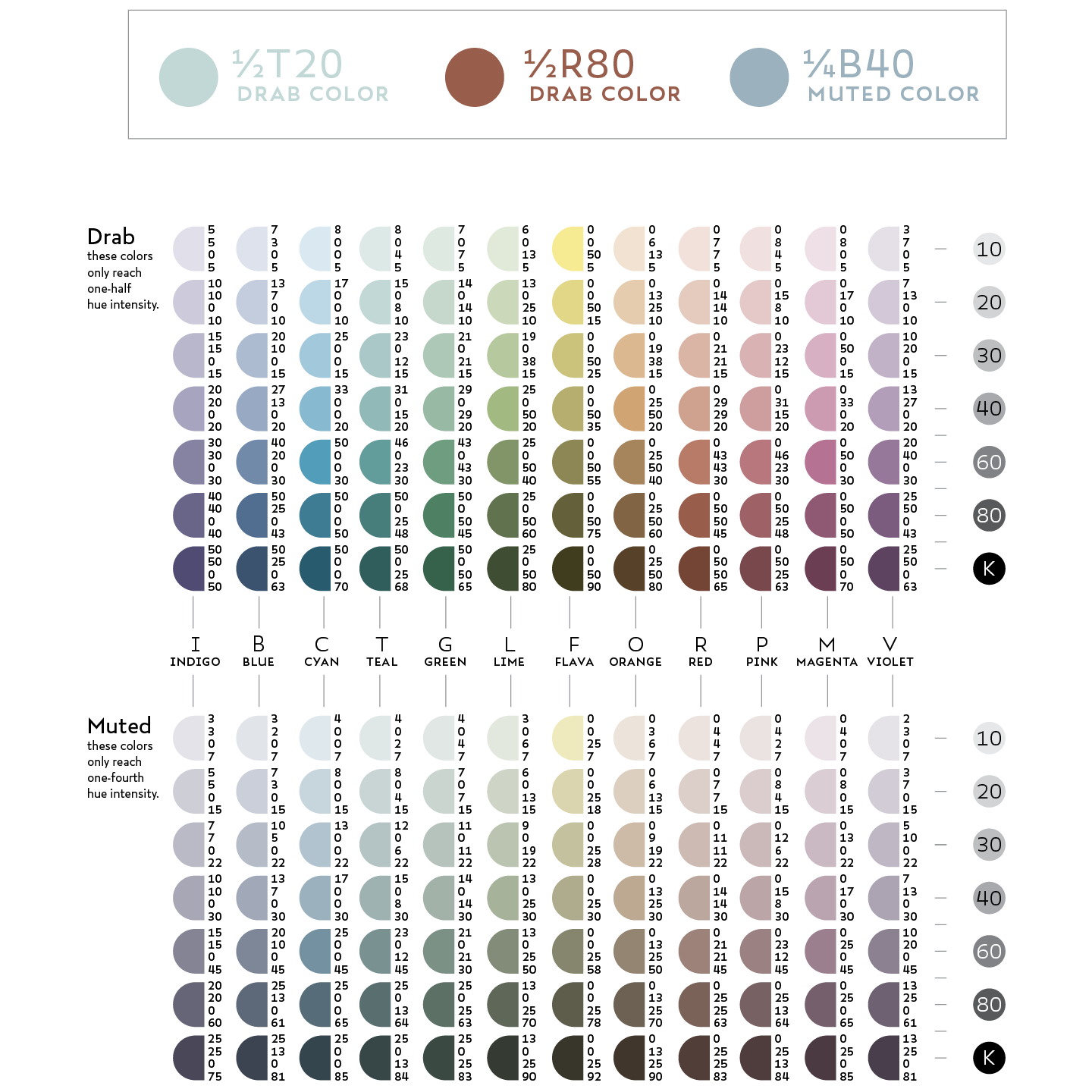
quiet colors: drab and muted
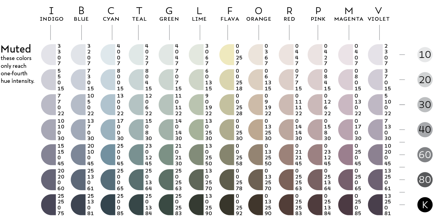
Quiet colors are less loud than loud colors. A drab color has roughly half the loudness of a loud color, while a muted color has roughly one quarter the loudness of a loud color. The colormix of a quiet color should be derived directly from the mix of the corresponding loud color. Quiet colors are named after their loud equivalent, but add a prefix signifying their relative loudness—e.g., “Half-” or “Quarter.”
Muted Lime as dark as 30% black.
To derive a drab or muted color from a pale or true color, first multiply the values of all the process hues in its colormix by the loudness ratio (.5 for a drab color, .25 for a muted color), then add K equal to the darkness value lost in the reduction. Were I to derive a drab equivalent to True Cyan, I would change the C component from 100 to 50, then add 30K to make up the darkness lost.
To derive a muted or drab color from a rich color, derive the appropriate quiet version of its true color by the above process, then add K until you reach the desired darkness value. By adding 20K to the Drab Cyan formula above, I would make Half-C80.
mix with two process hues
Adding the third primary hue to a colormix that includes two primary hues results in a darker, less loud color. In the example below, a third of Yellow is added to a mix of two-thirds Cyan and a full measure of Magenta. A third of each of the primary hues roughly equates to a third of K (33%).
Chromata
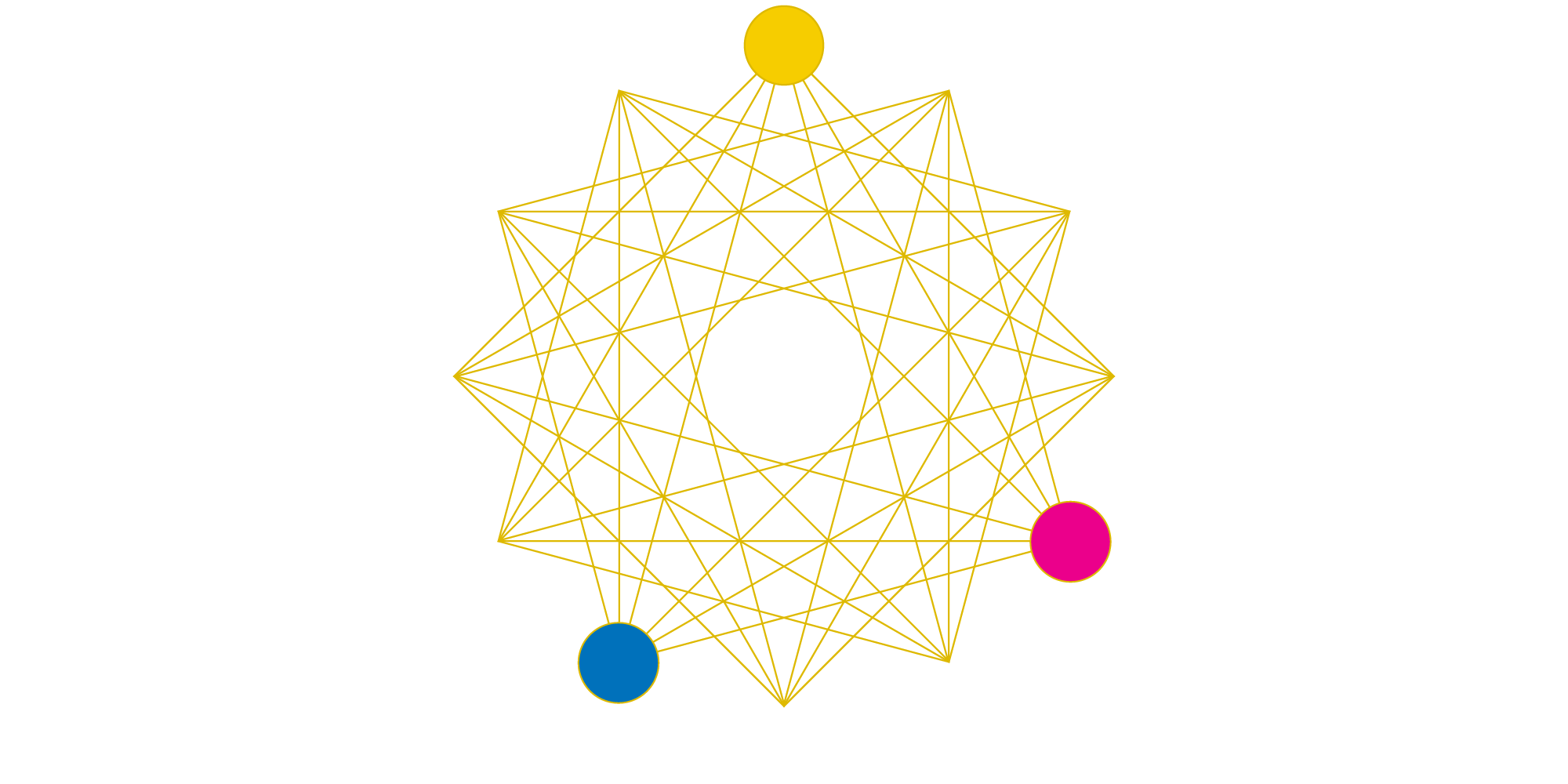
During the summer of 2016, I realized that the intervals I had put into practice were twelve evenly distributed points along a spectrum of continuous variation—the direct visual equivalent of the musical chromatic scale. When my friend Nevan showed me how his guitar worked, I noticed that the fourth and fifth intervals he played had an equivalent chromatic structure to a split complement in color. Then, it occurred to me: could the principles of music theory be translated to my chromatic color system?
I assembled my twelve "color-notes" into a radial configuration much like a clock, and began to draw shapes much like pitch constellations—a way of visually mapping chords in music. The results of this experiment were spectacular—by using geometric forms to model the structure and balance of palettes, I discovered that tone and hue share much of their aesthetic logic.
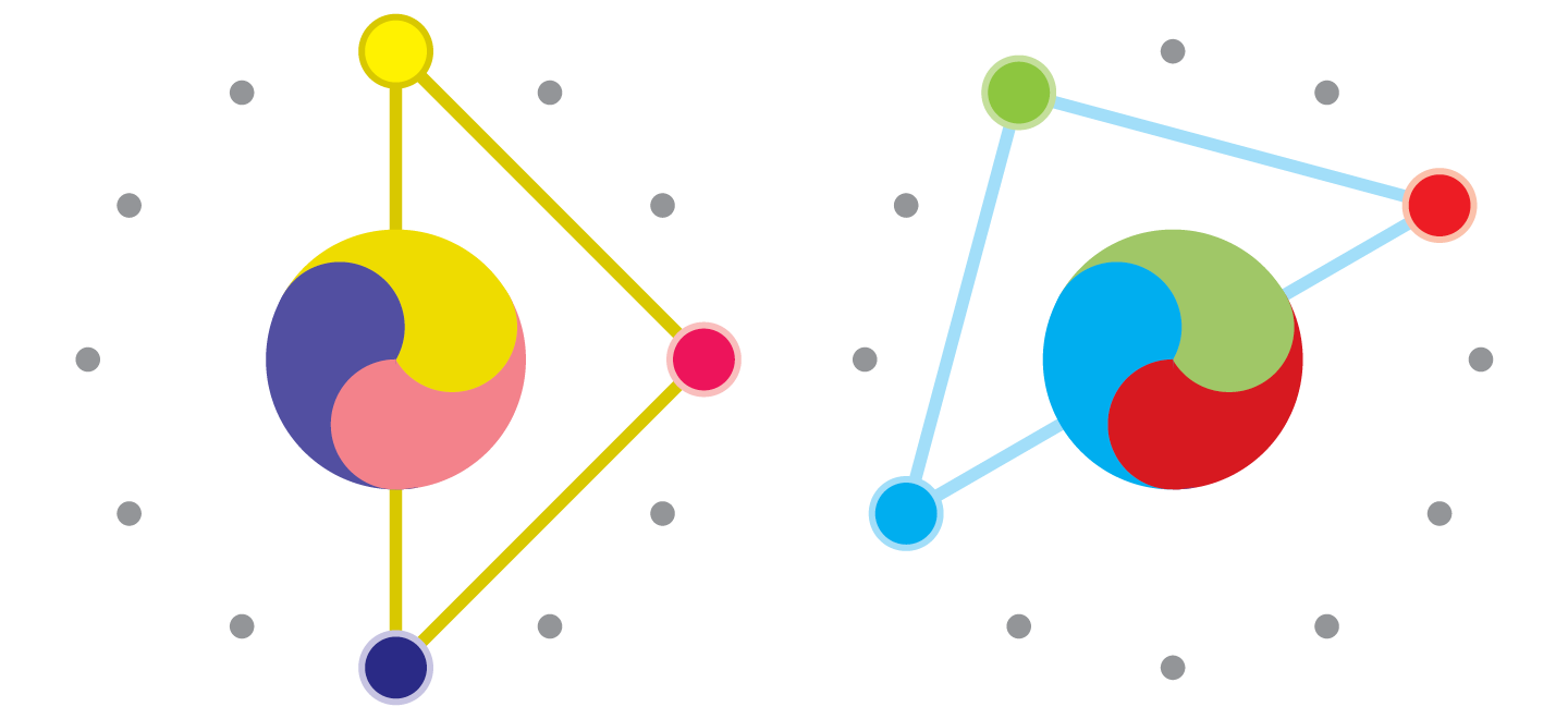
oppositions and tetranes
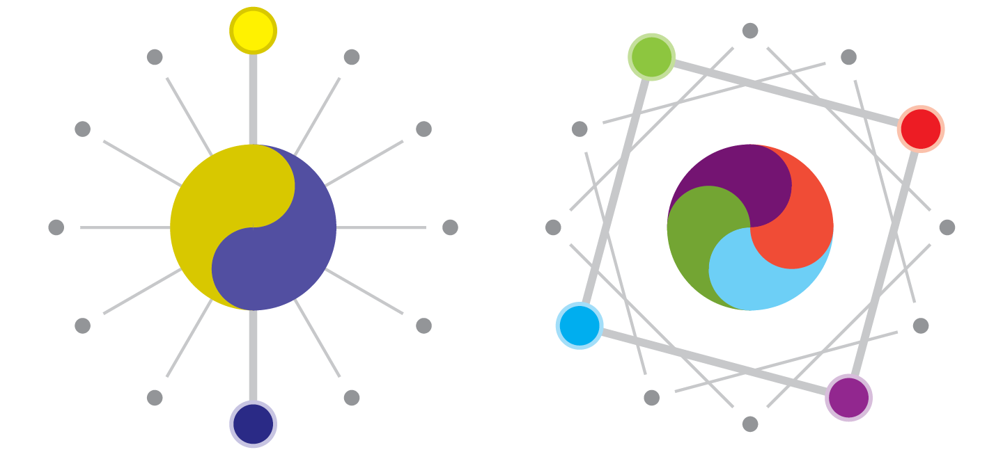
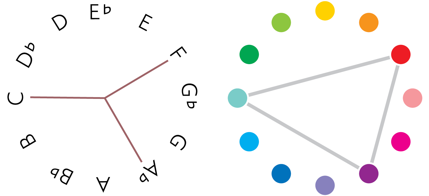
The opposition relationship is the visual equivalent of the musically discordant diminished fifth or tritone. Such colors strike a potent, dynamic balance, but do not necessarily clash as in sound. Because Opposition is a super-symmetrical relationship between two notes, it occurs six times in a twelve-note spectrum. Colors in tetrane would be adjacent corners on a perfect square inscribed upon the colorclock. Four colors in tetrane are called a Square.
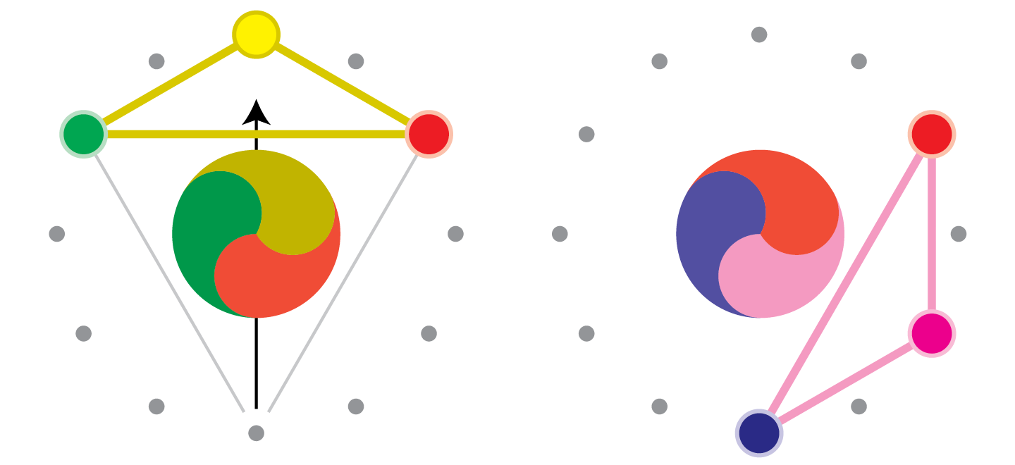
complements: the fourth and fifth intervals
A Complement is a pair of notes a half step away from Opposition. A Split Complement is the hue equivalent of the musical perfect fifth interval. A group of three or more hues interconnected by split complement relationships is called a Quintal Stack, or simply, “Quintal.” These palettes are extremely consonant, but express a sensibility more “narrow,” or “specific” than most other sets of three. This is because the hues within a Quintal stack tend to cluster together on either side of the spectrum.
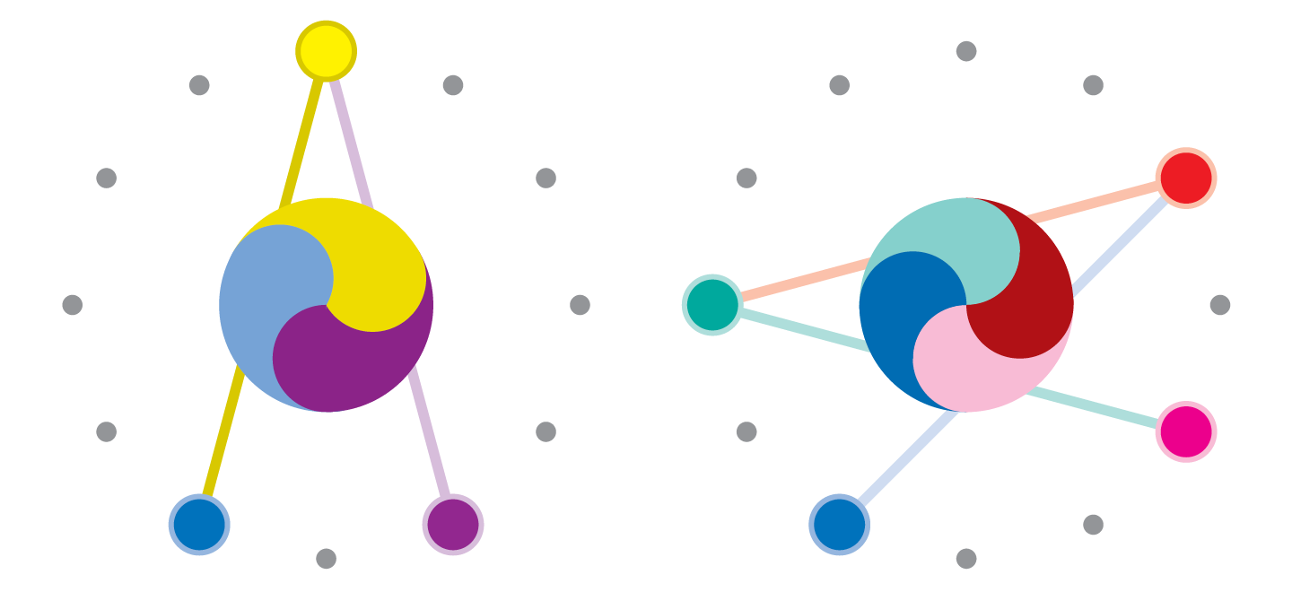
trines: augmented chords
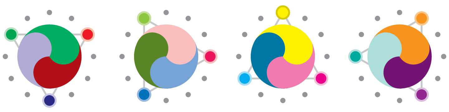
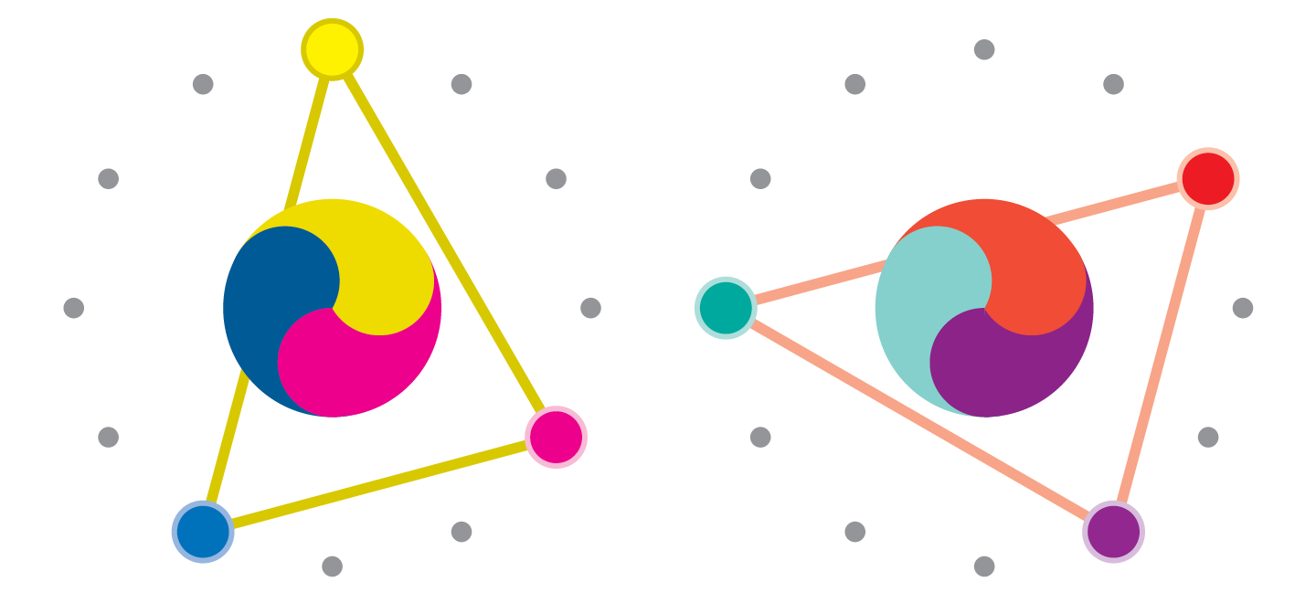
Colors in trine together would be the corners of an equilateral triangle overlaid on the colorclock. Three colors in a completed trine are called a Season, a structure equivalent to a musical augmented chord. There are four different seasons on the colorclock.
trios: major and minor chords
A trio is a trine in which one of the hues has been shifted a half-step. The result is a set of three hues related by trine, tetrane, and split. These palettes are equivalent to a major or minor chord in music, however, they do not carry the same connotations in terms of feeling. That is, a “minor” palette does not feel more “sad” on average than a “major” palette in the this scheme.
inverse trine
An Inverse Trine is a Trine hue structure with one of its hues swapped for its opposition. This structure is stable, but narrow in scope, spanning only five hue steps. The inverse trine is a densely clustered analogous palette—it tends to lack a sense of movement and dynamicism that comes with a jump across the spectrum.
inverse trio
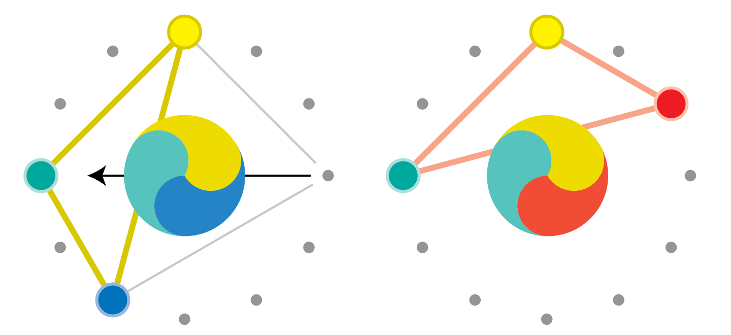
An Inverse Trio is a trio hue structure in which the hue replaced by its opposition, leaving the complement of the original structure intact. Like the Inverse Trine, the Inverse Trio is an analogous palette, however the inclusion of the complement adds a sense of energy that the inverse trine lacks.
trifecta: diminished chord
A trifecta is a group of three hues related by opposition and tetrane (see above). It is equivalent to a diminished chord in music.
diatonic scales
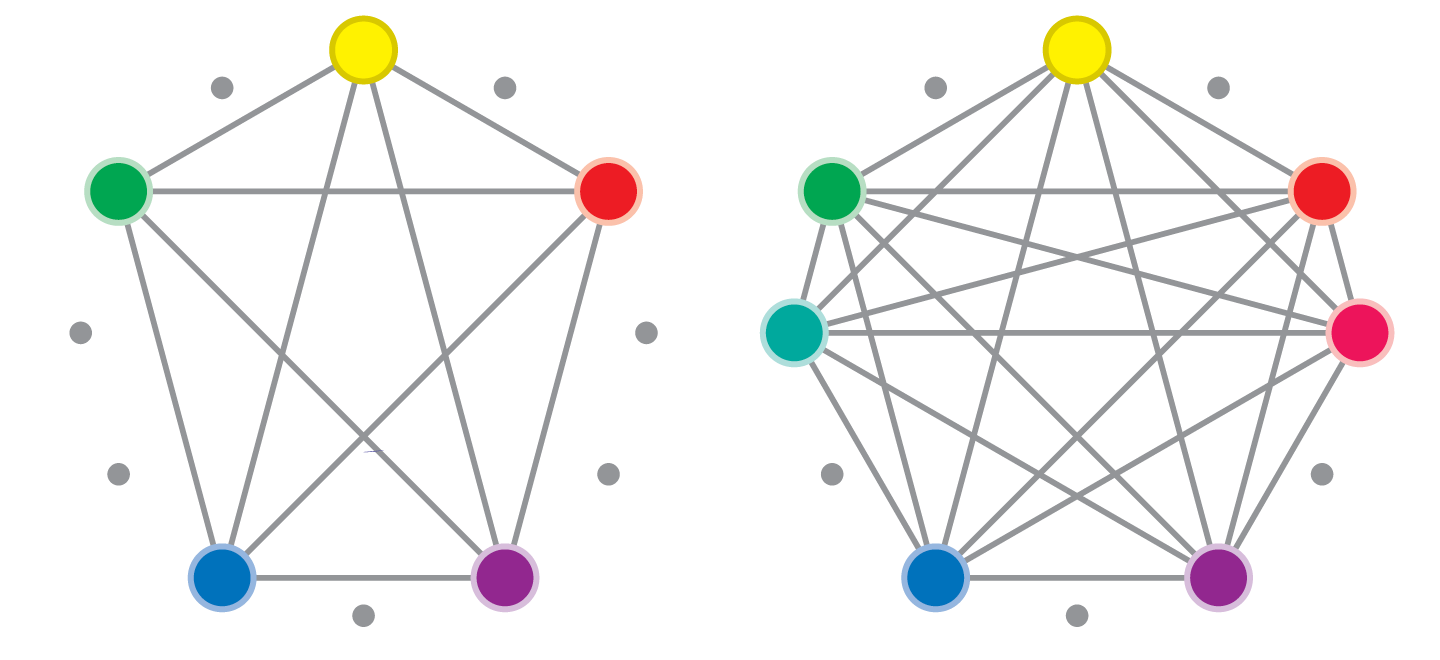
When designing a system of colors to be used in modular combination through a series of applications, a diatonic scale structure is an ideal tool. Diatonic scales are sets of notes—generally five (pentatonic) or seven (heptatonic)—spread as far apart as possible from each other among the scale of 12. Less complex arrays are better served by a pentatonic scale, which contains two trios. A heptatonic scale contains six trios and one trifecta, yielding lots of well balanced palettes and pairings that could be used throughout a massive style system. In both a pentatonic and a heptatonic scale, all hues are contained in a single quintal stack.
Darkness and Dissonance
While these hue-structuring models helped me rethink the way color was used in Delve, I observed as I worked with the system that some combinations whose hue were related through the scheme still looked awful together. The princples of disharmony are quite different between sound and vision: sounds close in tone or with certain specials tone relationships sound ugly, while colors too close in overall darkness look ugly.
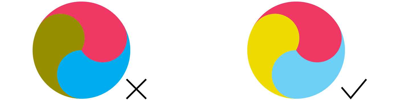
When two touching colors are too similar in brightness and different in hue or saturation, a clash occurs. Clashing colors appear to vibrate on the page, an effect that intensifies with greater hue difference. Colors should be at least 10K away from each other in order sit comfortably side-by-side.
This quality represents a major difference between color and sound aesthetics: sonic discord comes from notes of analogous pitch (compare to hue); visual discord comes from colors of analogous darkness (compare to octave).
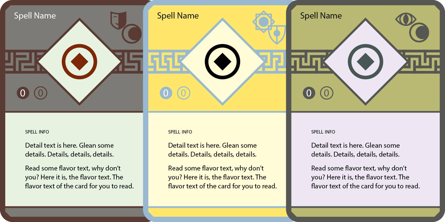
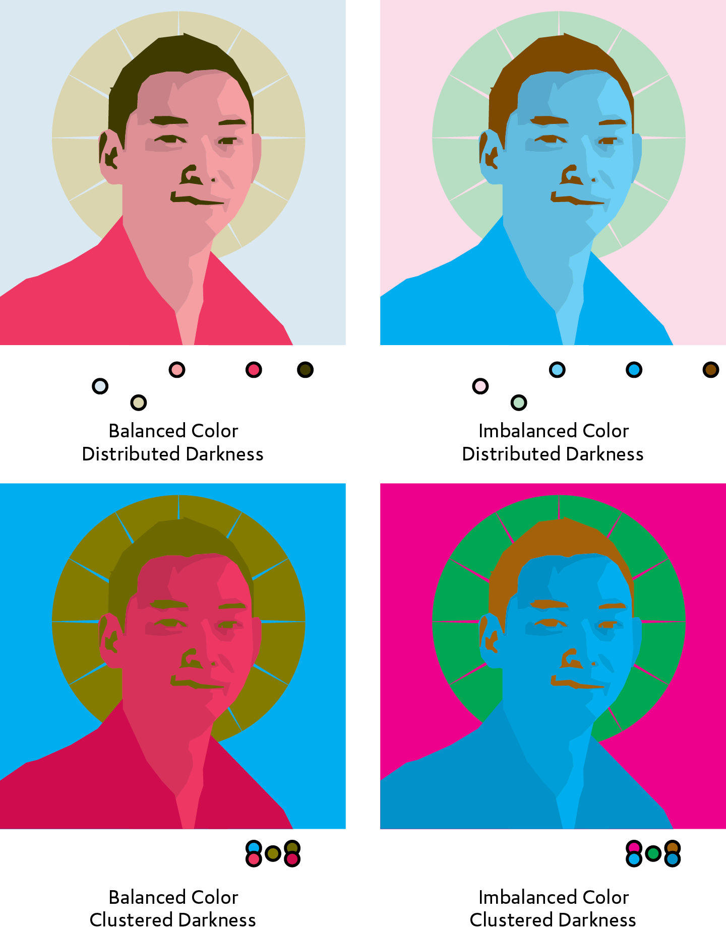
Palette Modes
For the final leg of my research,I attempted to build a typology of darkness and saturation arrangements (which I termed "palette modes") to which a hue structure of up to five colors could be applied. I identified five types which demonstrated the range of the system well.
gay
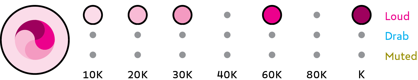
Uses loud colors across the full darkness range to convey a sense of vivacious joy.
dour
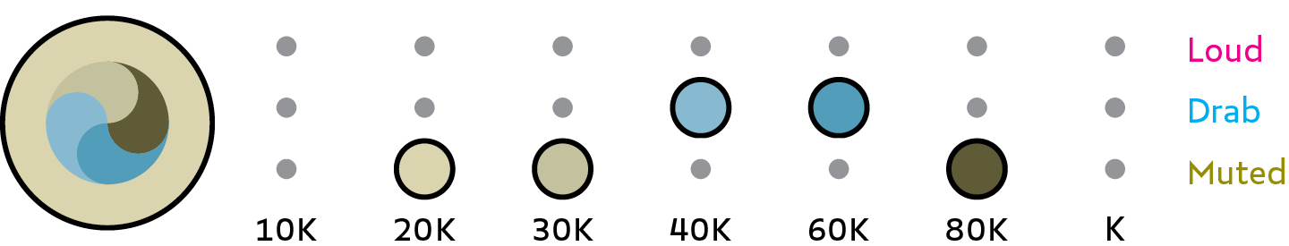
Uses muted and drab color in the 20–80K range for a distinguished or mature appearance.
soft
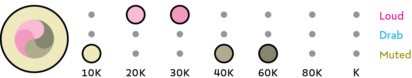
Uses Muted and Pale color in the 10–60K range to make a gentle impression on the eyes.
bold
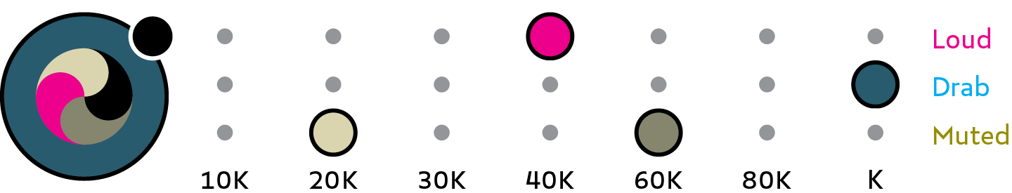
Uses a dark, drab background dressed with muted colors, a medium-darkness loud color and black to assert confidence and power.
accent

Uses a light, muted background supported by a slight shade and white, while a loud and dark-drab pair dominate the foreground.
This system has been tremendously successful since its implementation in the design of Delve. The Colortuners I employ in my design process are laid out below. For each color, process values are give in descending CMYK order. I highly recommend using this system for complex palette design jobs.
Appendices
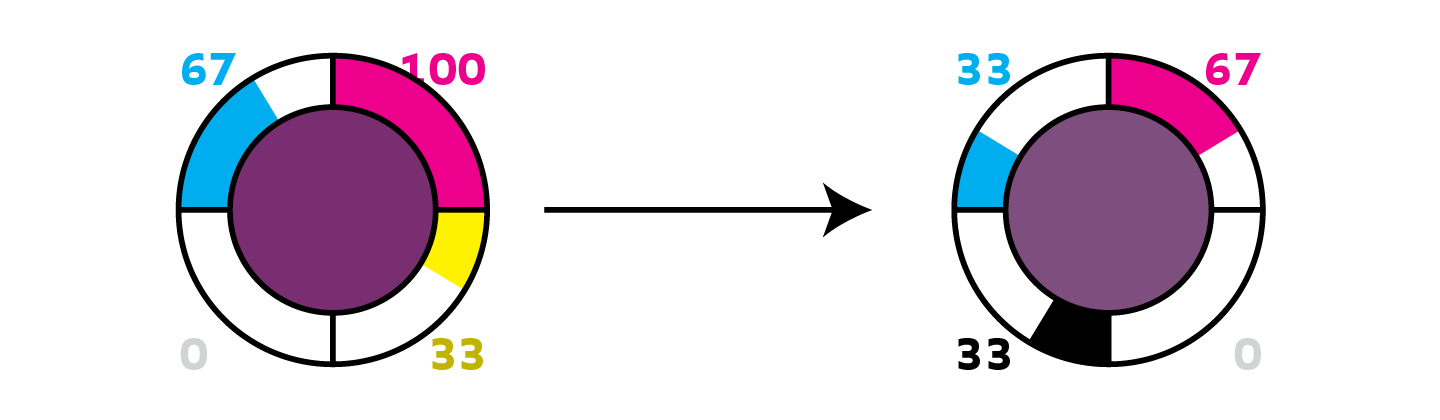
1. palette explainer detail
↖
2. loud colormixes
↖
3. quiet colormixes
4. triple interval
5. alternative alignments & hue names