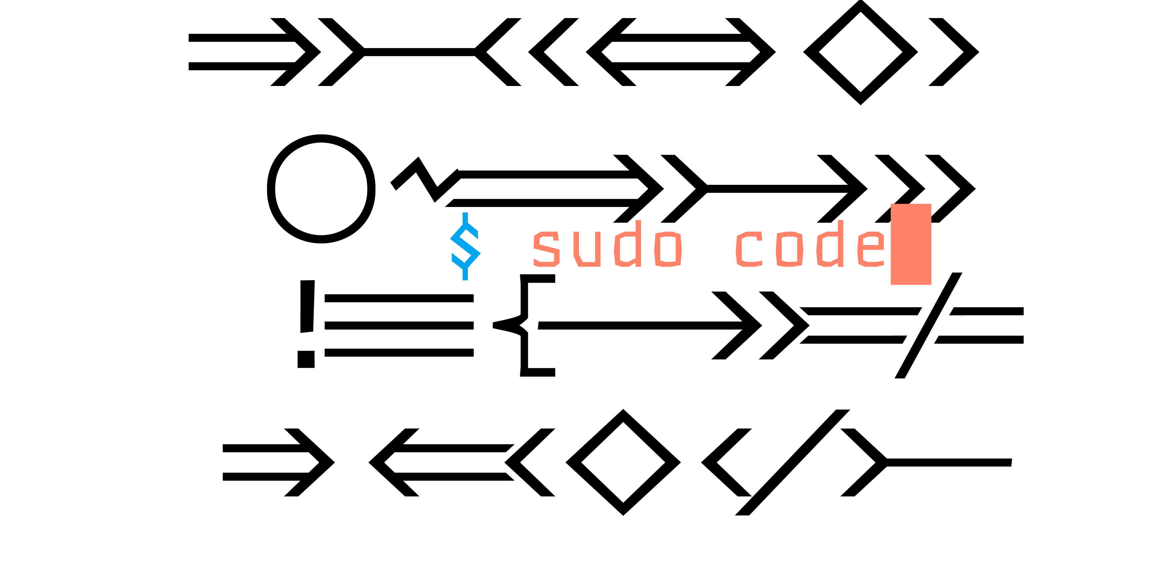
Sudo is the ideal modern coding typeface. Its robust, rugged cut renders well at the smallest sizes, and its proportions are optimized for readability in an editor environment. Sudo supports code ligatures of unlimited length both to clarify expressions (-->) and create structure (~~~~~~~).

Features
Code Proportion
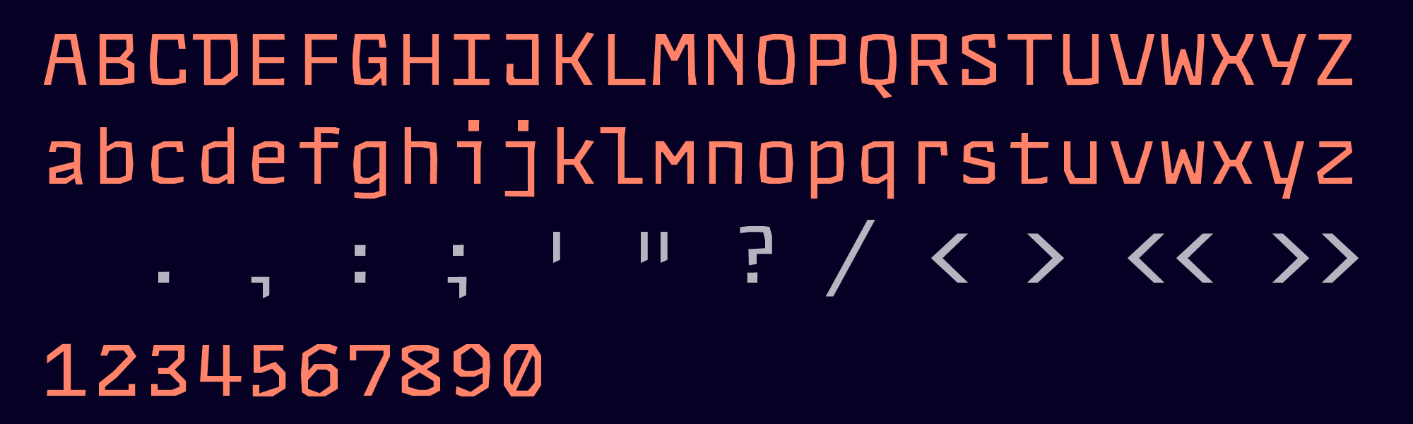
Sudo is drawn on a monospaced skeleton uniquely adapted to the editor environment. Punctuation and symbols are enlarged and in some cases redesigned to disambiguate them and reflect their essential role in the code environment. Fine details have been scoured from Sudo's robust, chunky alphabet. What remains underneath are stoic, square-built letters, irreducible in form.
Extended Keyboard
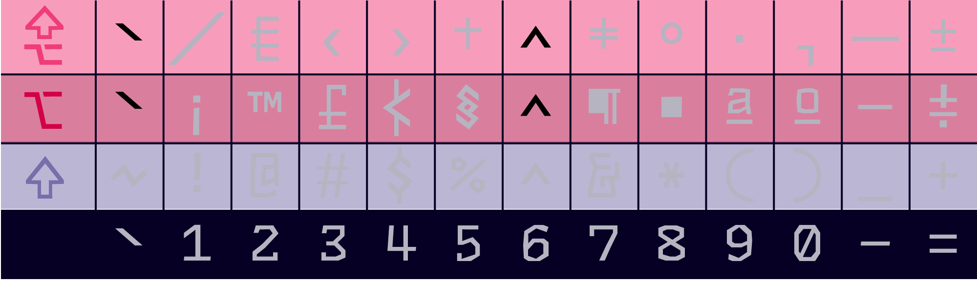
Sudo supports the entire Mac ⌥ alt and ✒ alt-shift sets. Most of these will never be used, but they're all there in case you need them.
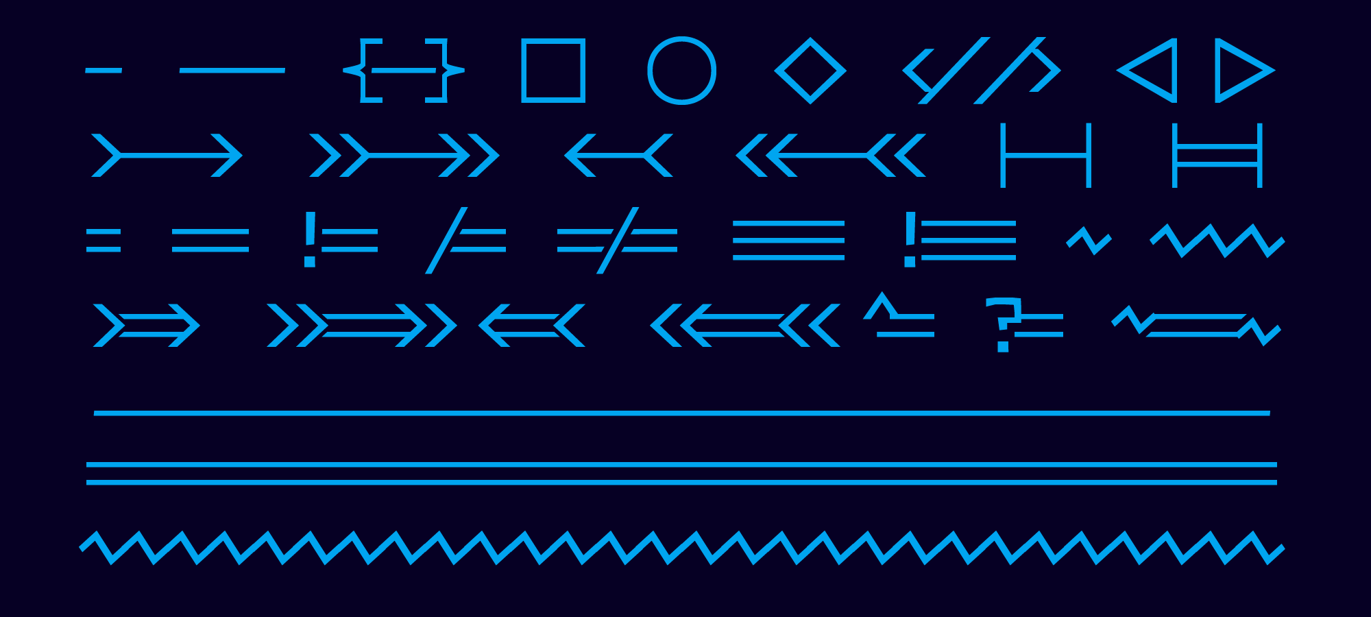
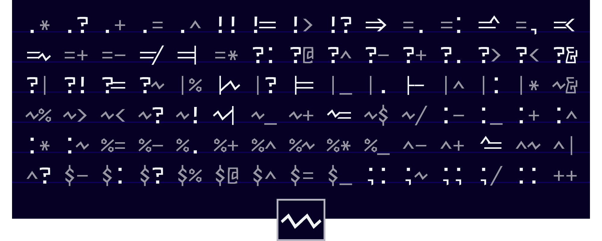
Code Ligatures
When you enable font ligatures in your editor, logical expressions are transformed to express themselves more clearly. "-->" becomes "-->".
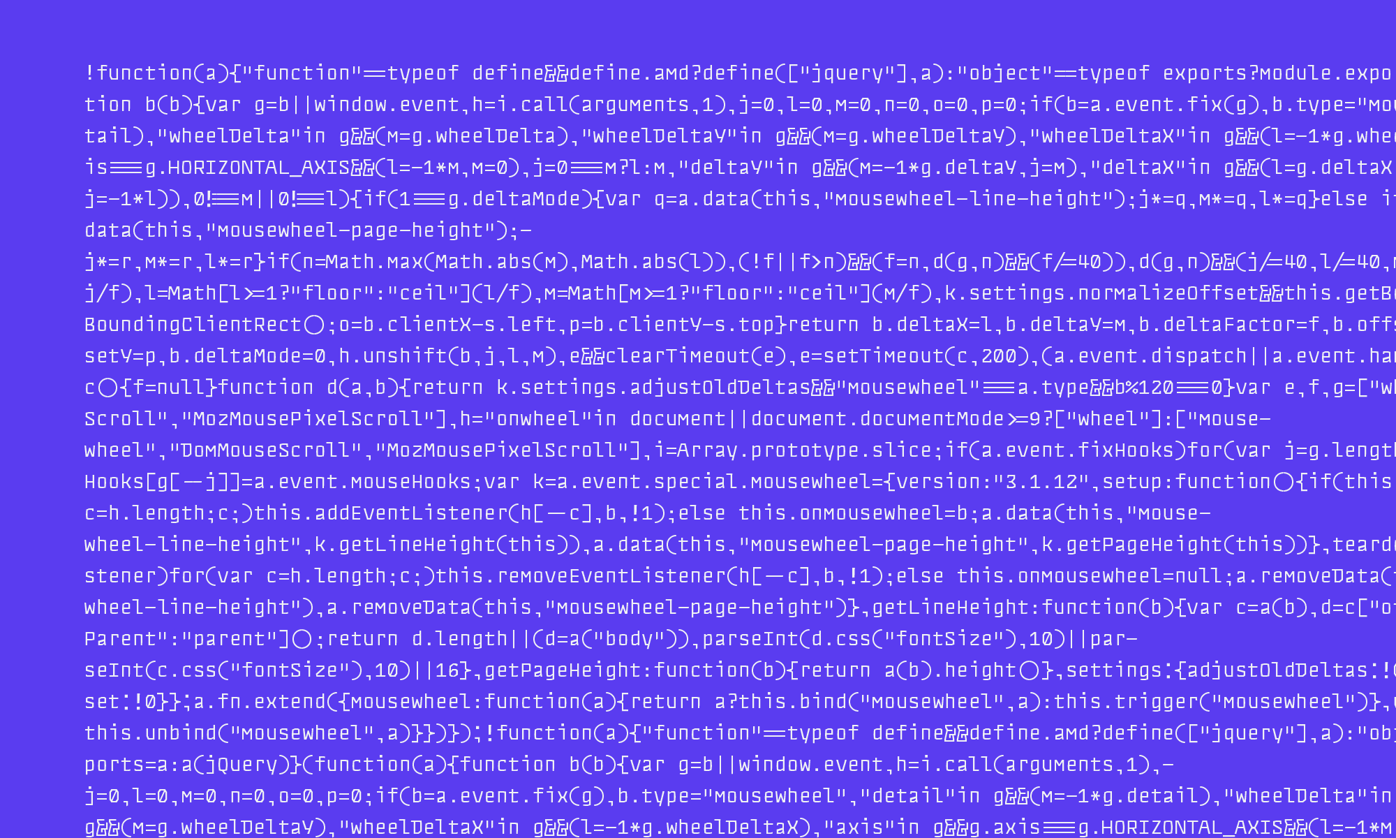
Console Typography
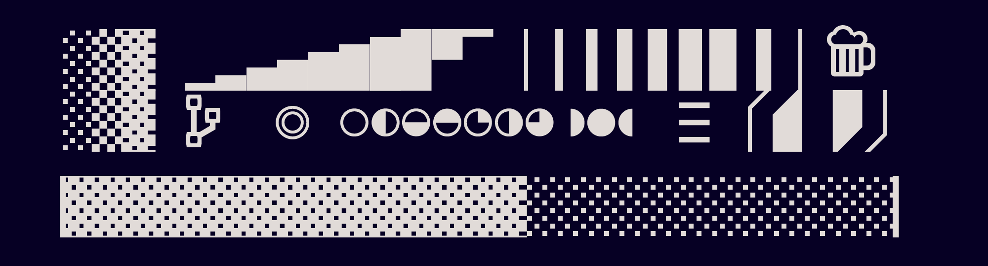
Set your your favorite terminal to Sudo. It's got the glyphs to handle progress bars and vim airline.
Pseudokerning
With ligatures enabled, some glyphs automatically optimize their own internal structures to better fit in.
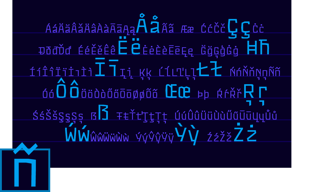
International
In addition to English, Sudo is fluent in more than 150 languages including Spanish, German, Portuguese, Turkish, and Romanian.
Languages
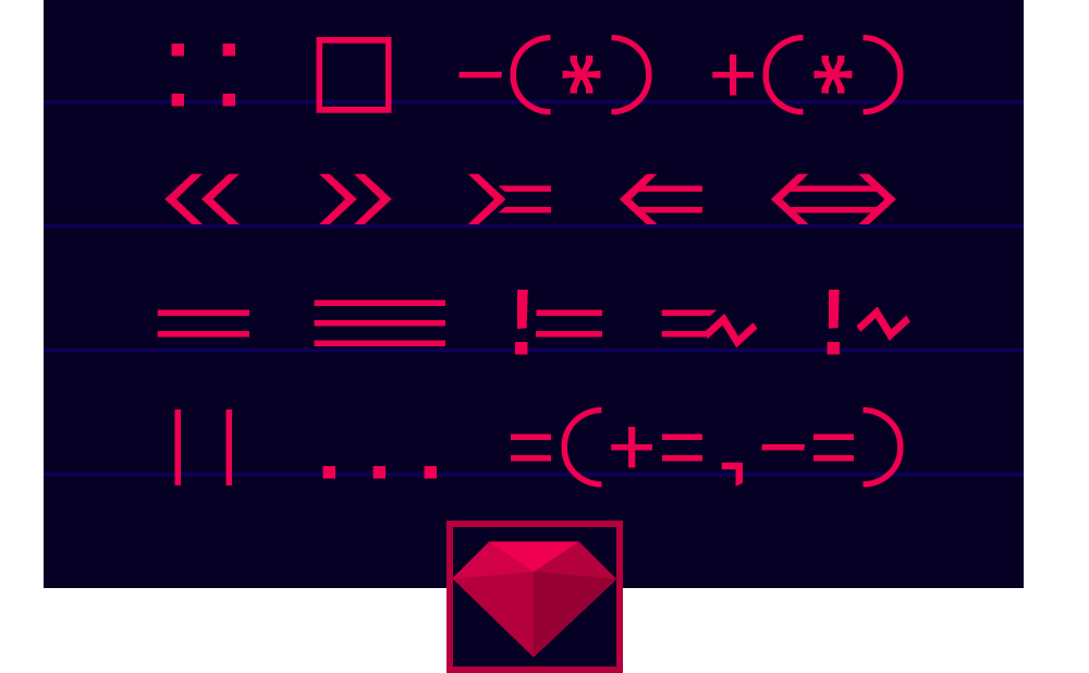
Ruby
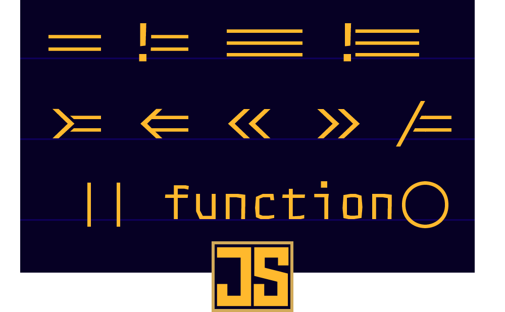
JavaScript
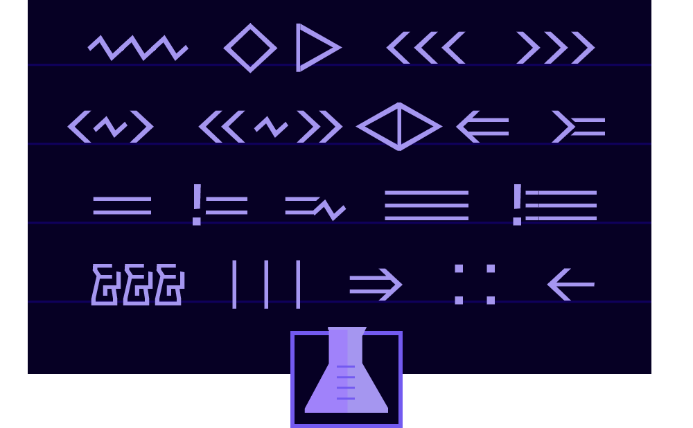
Elixir
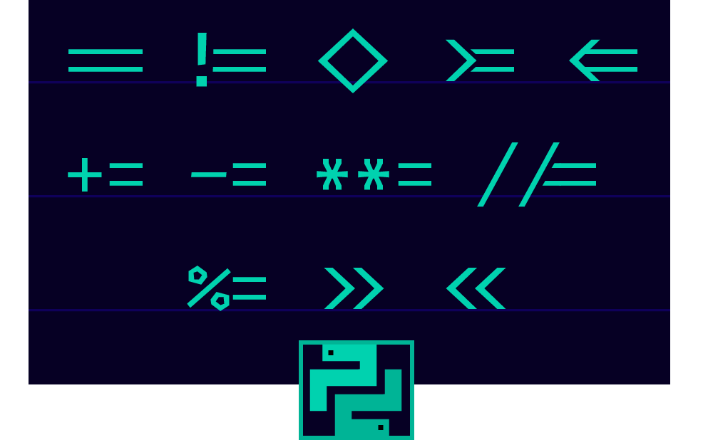
Python
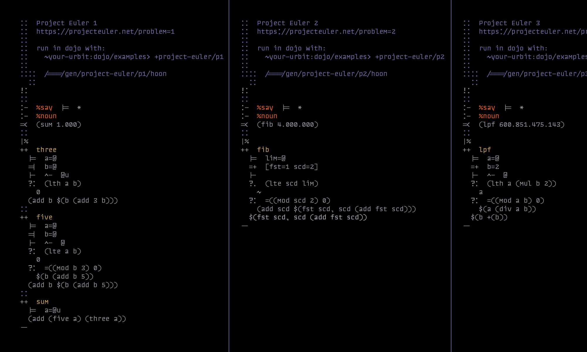
Hoon
Making Of
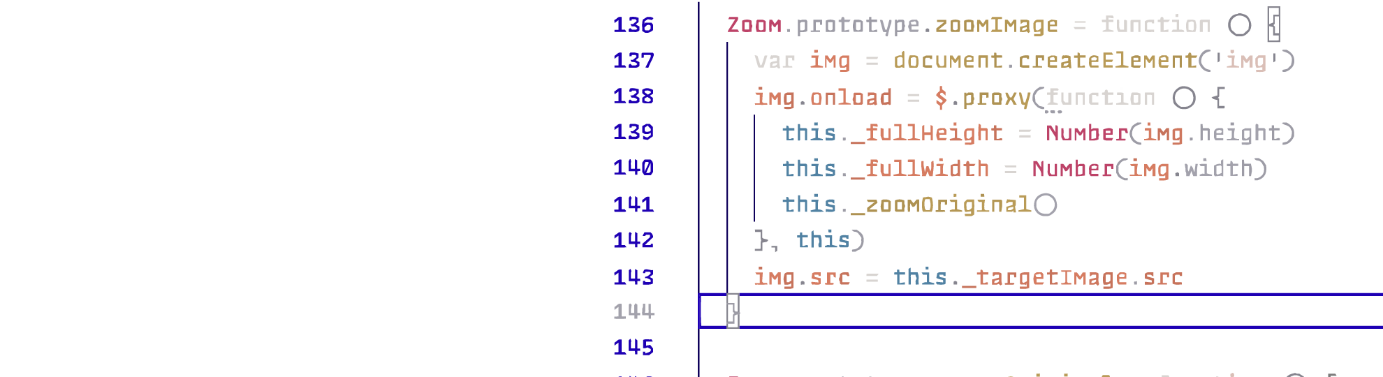
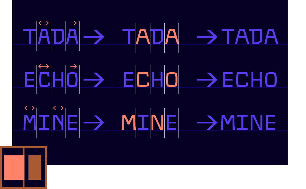
1. |Input| = |Output|
Before I made Sudo I ran some tests in Visual Studio Code to learn how its text environment applied font
features.
The first thing I noticed was how terribly it handled substitutions like ligatures. Unlike a rich text editor,
it
did not put cursor stops inside the ligature glyph to subdivide it, but always placed your cursor after the
extrawide glyph if you were anywhere within. This made for a terrible user experience: it was a matter of
memory
to ever know where your cursor was placed in a ligature such as ===.
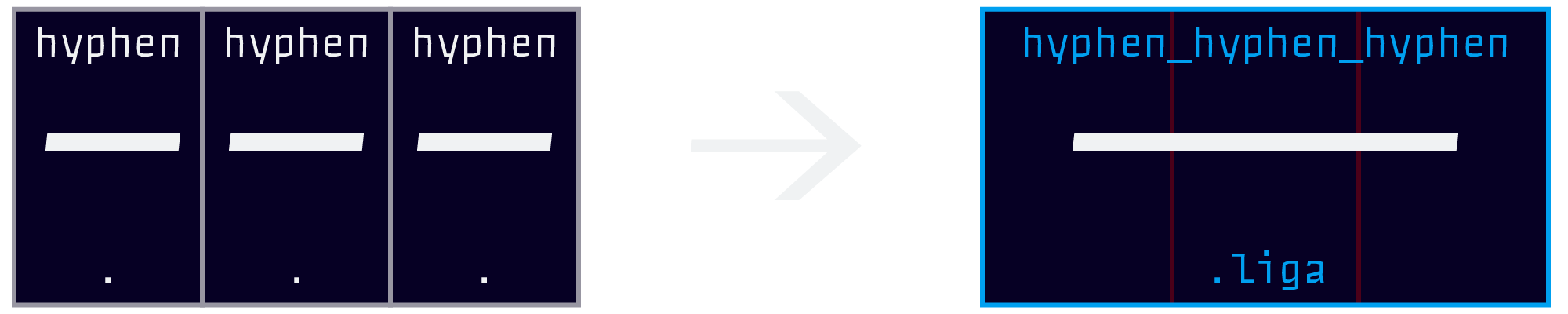
The feature would need to be creatively rewritten before it could be shipped.
The standard form of a ligature is,
sub equal equal equal by equal_equal_equal.liga;
A ligature rule like
this does take effect in VS Code—the problem is that the software literally replaces three glyphs with one.
This means that the only way to preserve cursor stops is to use a ligature feature with a 1:1 ratio between input glyphs and output glyphs. This feature would need to change each compatible glyph individually to a contextual form, like a script font does.
And just like a script font, glyphs would exist in four major varieties for five use cases:
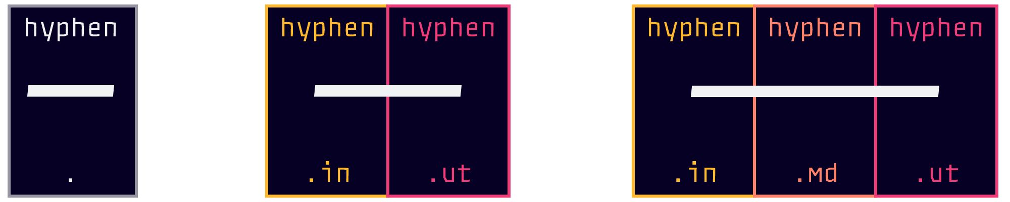
So I wrote a new series of rules to accomplish the same thing while keeping the glyphs separate.
      sub equal equal' equal by equal.md;

      sub equal' equal by equal.in;

      sub equal equal' by equal.ut;
It is important that the rules are written in this order, because a text editor will change each glyph in the reading order only once with the first suitable substitute it finds in the rules. This means that rules must be written for the most specific cases (such as the medial case, which has two stipulations) listed first, and the more general cases (like initial/final) listed last. This is the opposite of CSS-logic, in which you can amend earlier statements with later ones. The above font rule-order ensures that a medial glyph becomes medial rather than initial or final, since it would meet the initial and final criteria as well. Think of it as "filtering out" the specific cases before general rules are applied.
Unlike a script font, though, there would need to be several different “Motifs” for certain glyphs, such as > [greater], which has to form different arrows with -> hyphens and equals =>.
2. Motifs

Download
FREE (FOR NOW)
Sudo Code
+VSCode Theme